Berry Health is a full-stack, digital DTC health platform built for the African market, addressing problems that need a doctor’s prescription to treat, despite being highly common
My Role
UX Designer
UX Researcher
Product Manager
Project Duration
10 months (2022)
Type
Web App
Website
Industry
Healthtech
Client
Berry Health
Embracing the stigma and shame associated with healthcare as the initial step to achieving transformational and sustainable healthcare
The telehealth & digital pharmacy platform focuses on chronic, urgent, stigmatized, and underserved conditions in Africa. Their goal is to make healthcare accessible, cost-effective, and convenient.
The Problem
Due to the negative connotations associated with certain health issues, particularly in this region of Africa, persons afflicted with these conditions are often reluctant to seek medical treatment for fear of being embarrassed or judged. Furthermore, with the lack of affordable and accessible medical facilities, and usually long waiting times, these individuals are further discouraged from seeking help.
Similarly, mental health issues such as anxiety and depression are viewed with apprehension and hesitation, making it difficult to receive the necessary care. Additionally, the lack of privacy when purchasing medication from a pharmacy can make patients feel uncomfortable.
Our Goal
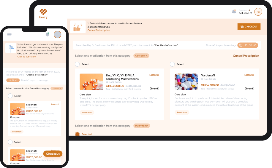
To address the problems of customers needing private prescription medication from a doctor without taking the traditional route of making an appointment, visiting the doctor, and finally picking up the prescribed medicine at the pharmacy.
It is envisaged that the digital telehealth and pharmacy platform will enable smooth customer experience to include medical consultation, prescription medication, and door-to-door delivery of prescribed medication from its in-house pharmacy without requiring customers to make physical visitation to local health centers.
“How can we make medical care delivery to the underserved and stigmatised conditions accessible, convenient and confidential”
COMPETITIVE ANALYSIS
Exploring similar solutions
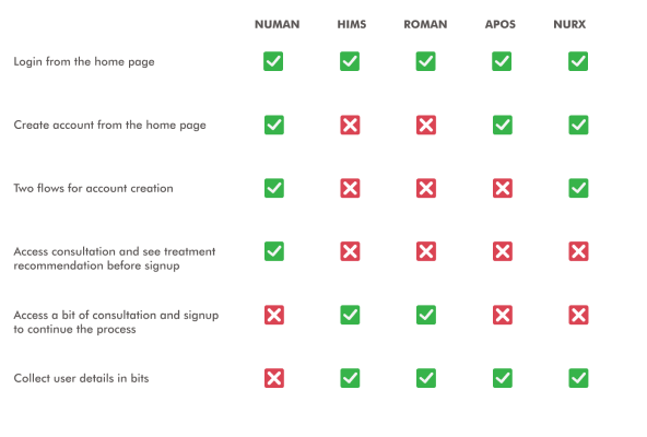
I started by looking at existing products, this helped me to know how they have approached the same problems. I was also able to figure out standard patterns in the industry which can assist in simplifying and enhancing the learnability of our own product. Interacting with these products made me see the things they have done right with visible results, and also the ones that could be improved and better suited for our users. To this effect I designed a competitive analysis table which at a glance visually compares all other alternatives
UNDERSTANDING OUR USERS
Who are the users?
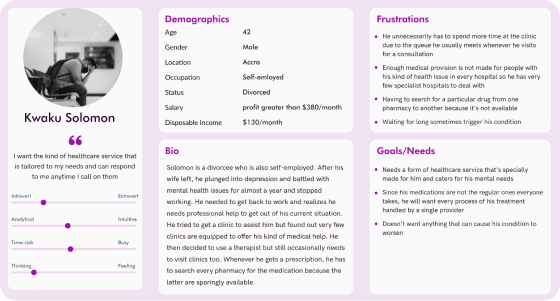
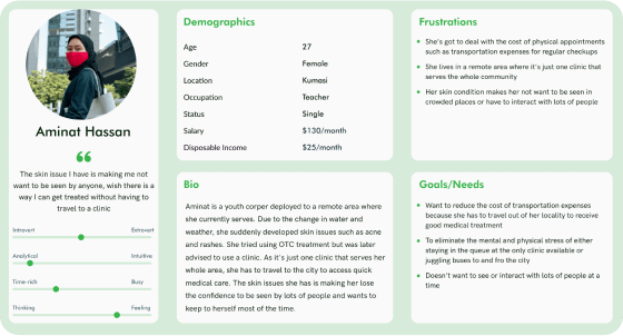
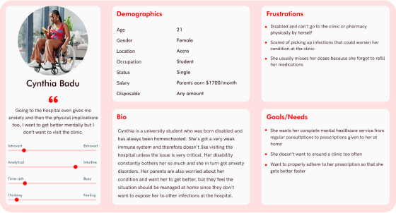
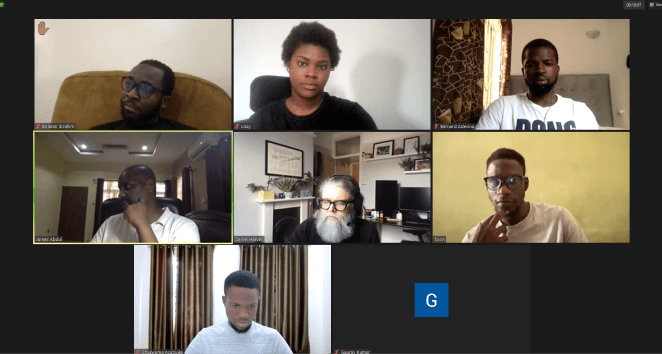
I sent out user surveys and also conducted interviews via video conferencing tools with different categories of people ranging between 20 and 56 years of age. I was able to get insights into who the target users are and the challenges they are facing
Why would they want to use this product?
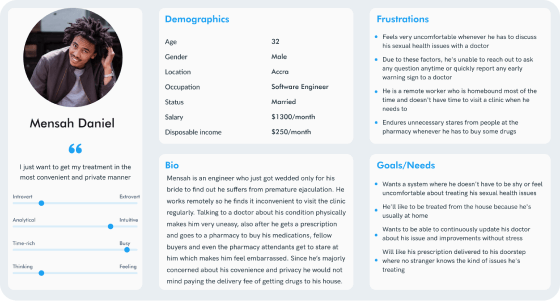
In other to figure out what could motivate anyone to use the app, I created user personas that accurately represent our target users, consisting of their pain points and needs using the data gotten from the research. Even though there was budget and time constraints for research, I still managed to have a a direction on what the people will love to have and use
IDEATING
Understanding user behaviours and enhancing usability
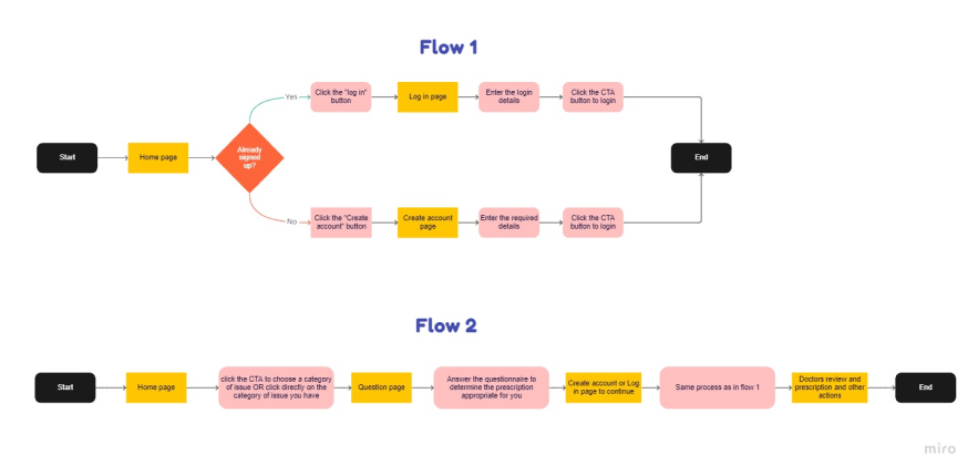
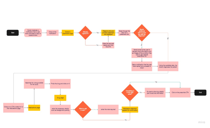
Using the personas and the ideas gotten from brainstorming and competitive analysis, I mapped out user flows for important goals a user might want to accomplish within the product. The flows helped me better understand user behaviours, highlighting places that could be edge cases that require extra provision, and places to reduce friction due to unnecessary steps.
I also sketched low fidelity screens from the UX artefacts I had including the user stories from the product manager, that were tested internally by stakeholders and other team members, feedbacks were gotten and incorporated into the next iterations I made
Prioritizing function over form
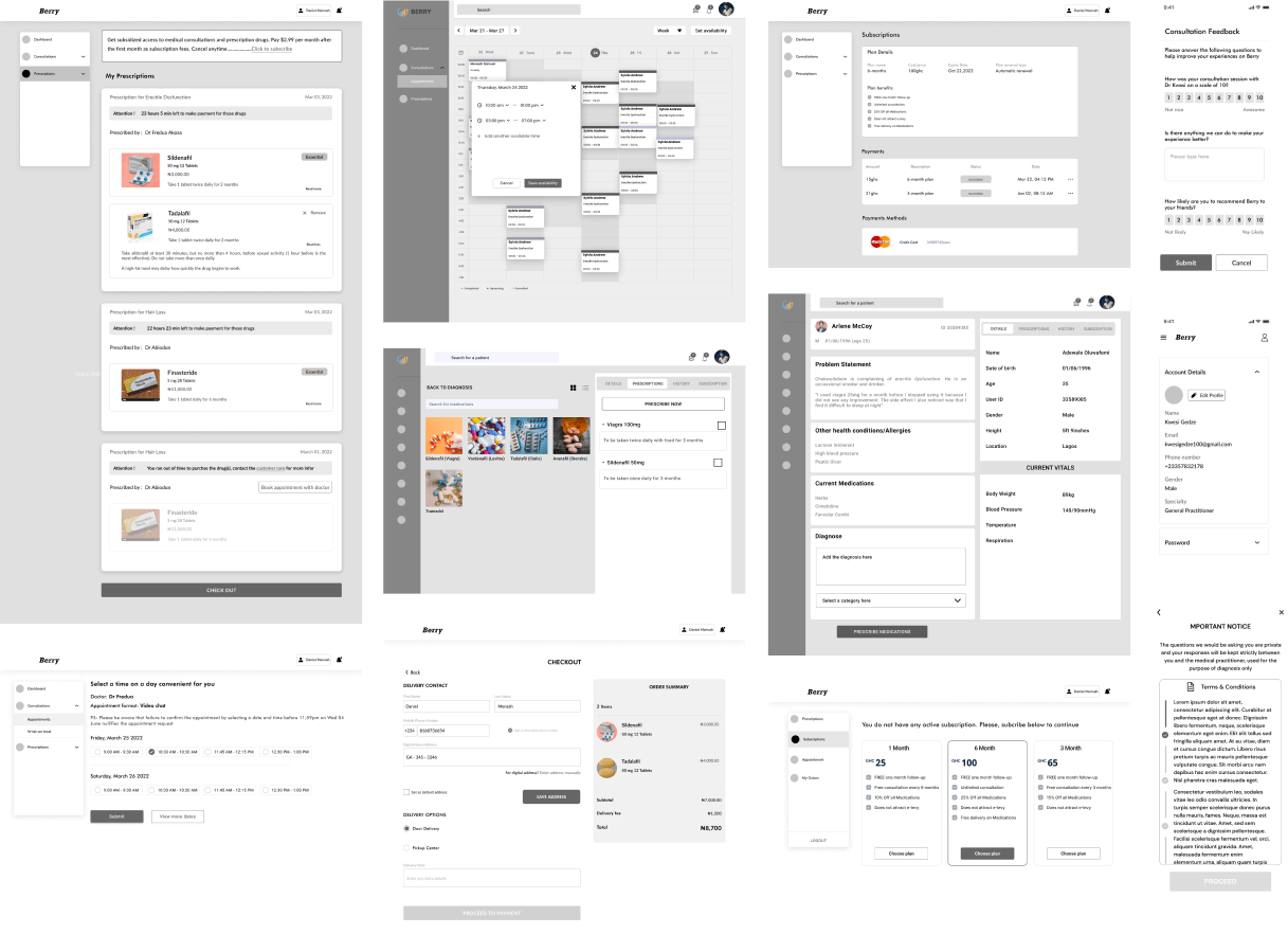
The project was done in an agile environment, where we held weekly sprint demos to show our progress to the business stakeholders. We presented lo-fi UI screens to ensure that our focus was on providing a functional experience for the user, rather than aesthetics. Once the lo-fi screens were approved, they were then passed over to the UI designers to add life and create a finished product, with only minimal changes to the arrangement and structure of the elements.
VISUAL DESIGN
Deciding on the visual style
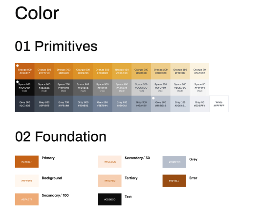
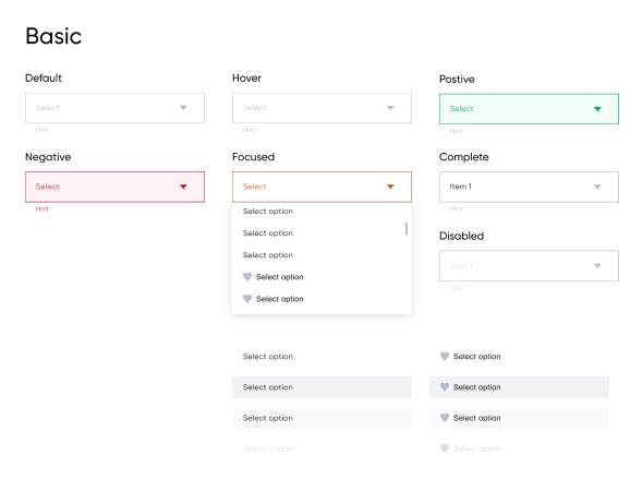
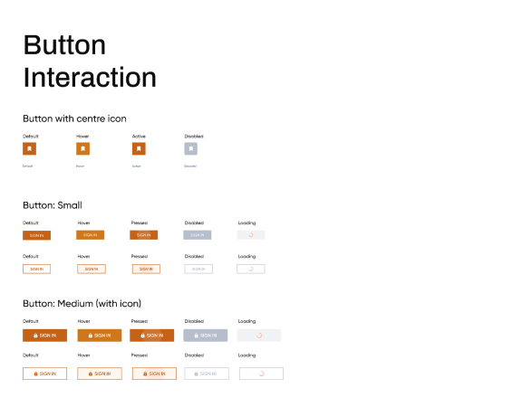
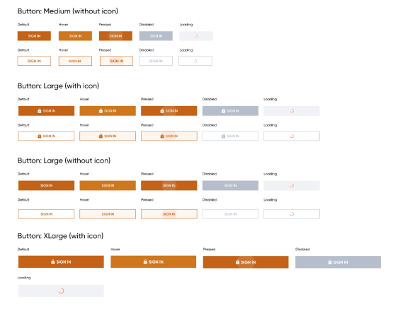
I worked alongside the brand designer and UI designers to create a comprehensive style guide for the project. With time being a constraint, we needed to put something together quickly rather than waiting for a standard design system. This guide served both the designers and engineers, but we are also in the process of curating a Design System (DS) for the app.
We have carefully chosen our words to create a tone that is sensitive, simple, and trustworthy. This includes our calls to action (CTAs), which are tailored to our users and our industry. By doing so, we hope to build a strong relationship of trust and assurance with our users
Graphical elements such as images, typography, colours, and icons have been carefully selected and organized to create an intuitive user experience. Colors have been chosen to evoke feelings of comfort and familiarity in users, while icons and UI patterns have been chosen that are industry standards with slight modifications, so as to give our product a unique look and feel, while still making it more learnable and user-friendly.
Visual and auditory feedback was also adequately accommodated within an appropriate time frame for performing any given task. As we know, without feedback, there is no meaningful interaction. This ensures that users are able to interact with their environment in a meaningful way, providing a more effective user experience.
The 8pt spatial system, 12-column layout grid, 96px margins, and 16px gutter all contribute to an effective design that embraces enough white space to help our users focus on the most important thing on the screen. This helps create a clean and clear interface that keeps the user engaged.
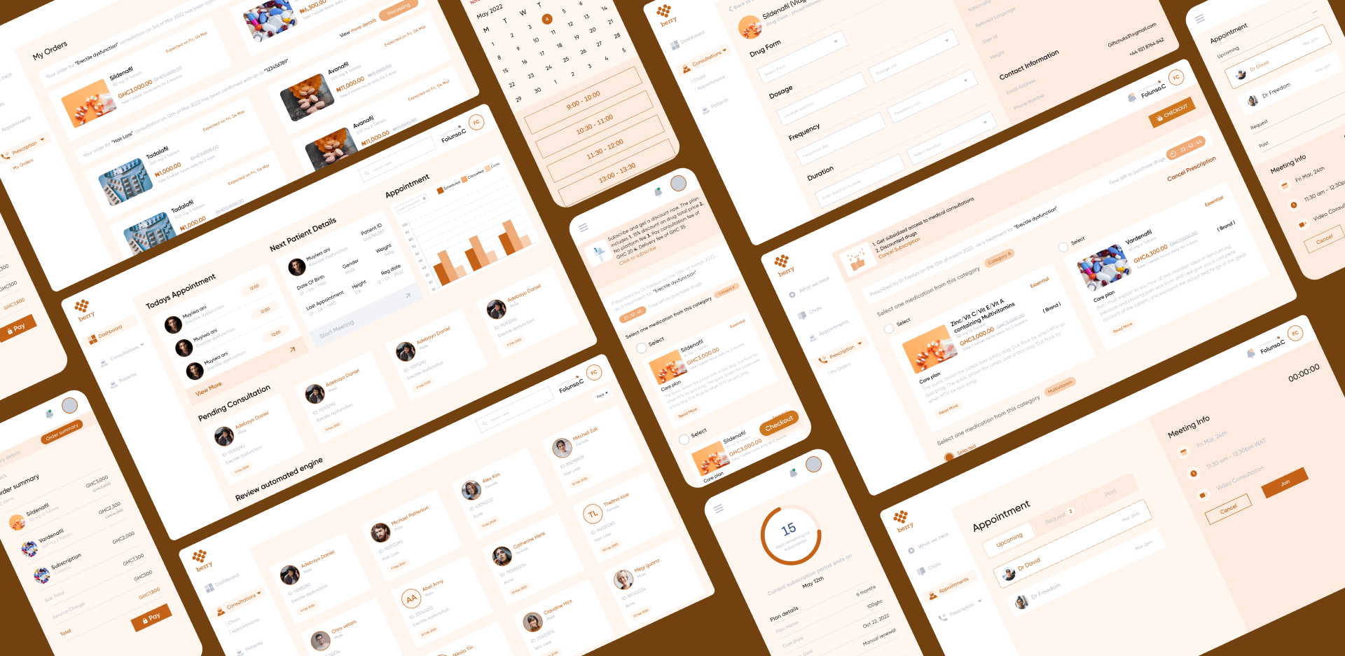
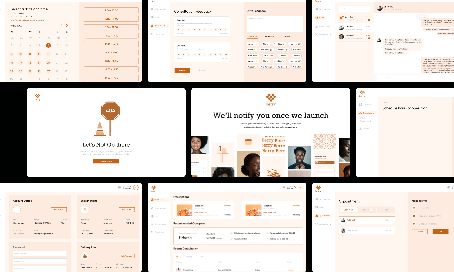
The combination of all the elements mentioned above created stunning, user-friendly interfaces that make it easy for users to complete their tasks quickly and efficiently. I also did rapid prototyping for the purpose of usability testing
USABILITY TESTING
Are the designs functional and usable?
To ensure the usability and functionality of the designs, I wrote a usability test script and conducted interactive prototype testing with the interviewees. After analyzing the feedback from the testing session, I made necessary iterations and used proper handoff methods to send the final designs to the development team. This ensured that all decisions were preserved and implemented correctly.
Other responsibilities
I must say I really enjoyed working on this project as I had to assume new responsibilities at different stages of the project, while learning and developing new skills
I worked closely with the backed engineers on curating the contents of the DB on Excel before its been populated in the codes
I was entrusted with the important task of serializing and structuring data for the front-end developers in JSON format. Despite my initial trepidation of coding in this language, I was able to successfully complete the assignment to the satisfaction of all involved.
When the product manager had to leave the project suddenly, it was a daunting task to find a replacement quickly. Upon the suggestion of the client, I decided to take on the role temporarily until a new hire could be found, while I took courses on product management. My deep understanding of the product made me the ideal candidate to step in and ensure the project was still on track.
Finally, I had the chance to act as a QA tester for the product. I tested the features using the user stories, reported bugs for the engineers to fix, and had the opportunity to participate in debugging sessions to help the engineers replicate the bug. It was a great learning experience!
REFLECTIONS AND LEARNINGS
This was a large-scale project that required a lot of effort from the whole team. One of the biggest challenges I faced with the UI designers was ensuring that the designs were consistent with the approved sketches. We had to work together in order to come to a consensus that everyone could agree with.
My Takeaways
Undervaluing a task can be a costly mistake – don’t let it happen to you! Make sure to always give the task at hand the respect and attention it deserves
Prioritize your features based on the effort required and the resulting impact. Avoid spending time and resources on features that have minimal or no impact on the product. By doing this, you can ensure that your efforts are spent on the development of features that will have the greatest impact on your product.
Iterating was the key to success – I could make up to five iterations on one screen, but the results were simply stunning! Each iteration brought something new, fresh, and exciting, leading to a truly remarkable end product.
What stage is the product
Launched a Beta product that is currently used for testing and collecting feedbacks. Wok is ongoing on the next phase of refining and testing before the final version release
MORE PROJECTS
Need further assurance that I’m the right fit for your organization? Then take a look at any of these 👇