AltSchool Africa is an alternative school that provides majorly tech skills to people looking to break into the tech industry. To improve their successful scaling, there is the need to improve their user experience, add more product offerings and make the design aesthetically pleasing.
My Role
Product Designer
Project Duration
Ongoing
Type
Web App
Website
Industry
Edutech
Client
AltSchool Africa
Project Overview
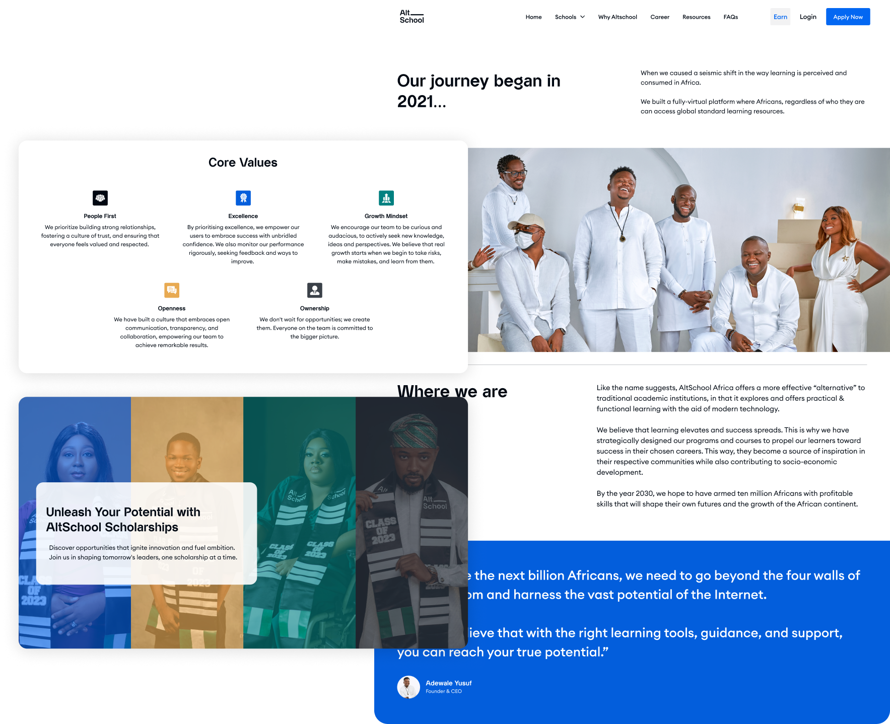
After initially launching with an MVP design, the company experienced significant success, eventually outgrowing its original product design. Recognizing the need for a transformative change, I was brought on board to execute a comprehensive overhaul, breathing new life into the various products.
AltSchool Africa is an innovative educational institution specializing in tech-focused skill development for individuals aspiring to enter the tech industry. With a presence in the industry for over two years, they have achieved remarkable strides in advancing tech education during this time.
The Challenge
The current designs are outdated and fail to reflect the essence of the company’s brand identity.
They lack the ability to effectively showcase the full range of new offerings that the company has developed over time
Goals
Seamless user experience across all products
Alignment with business objectives by enhancing user engagement
Enhanced aesthetics and branding
Design with scalability in mind
My Role
As the sole product designer within the company, I collaborated closely with a team comprising 2 product managers, 4 software engineers, 2 data analysts, 1 graphics designer, and the broader marketing team. Taking ownership of the entire design process, I personally crafted deliverables and saw each project from its inception through to its launch, and multiple subsequent iterations.
MY PROCESS
Design Analysis
In order to identify design frictions, I conducted a product analysis which included analyzing the strengths and weaknesses of existing designs and identifying areas for improvement. The audit encompassed reviewing various design assets, such as wireframes, prototypes, style guides, and other UI elements, while also evaluating the usability, accessibility, and consistency of the current designs. Below is what I discovered
Poor layout and navigation hinder efficient usability.
Inconsistent design elements, including colors, icons, and imagery, failing to represent the brand effectively.
Outdated and irrelevant content that no longer meets the needs or interests of the target audience
DESIGN DECISIONS
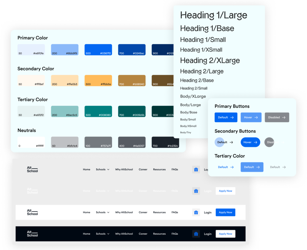
Style guide
We updated the colour palette to closely align with our brand identity, choosing colours that ensures a cohesive visual representation. While the typography remained unchanged to ensure readability and legibility.
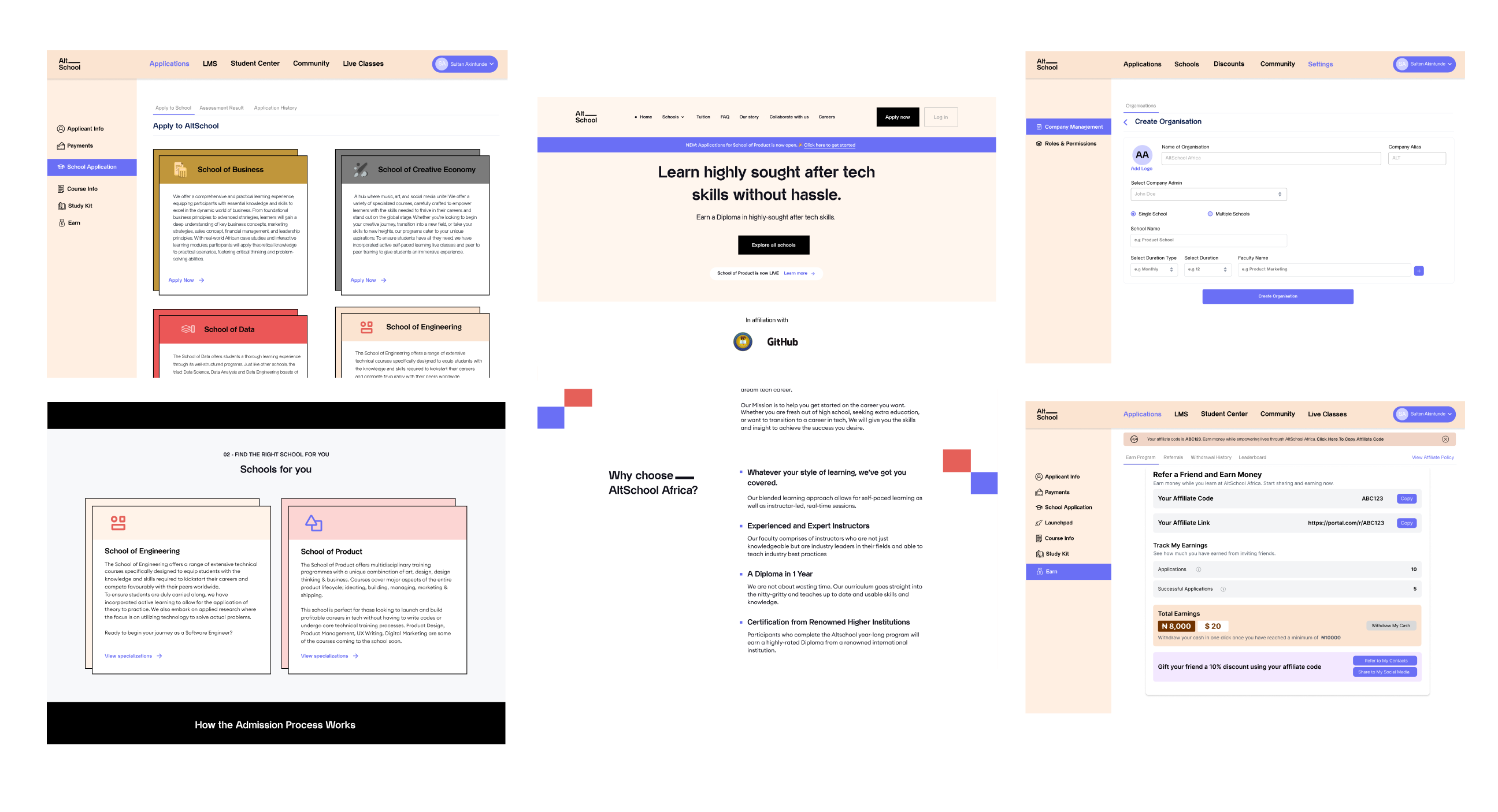
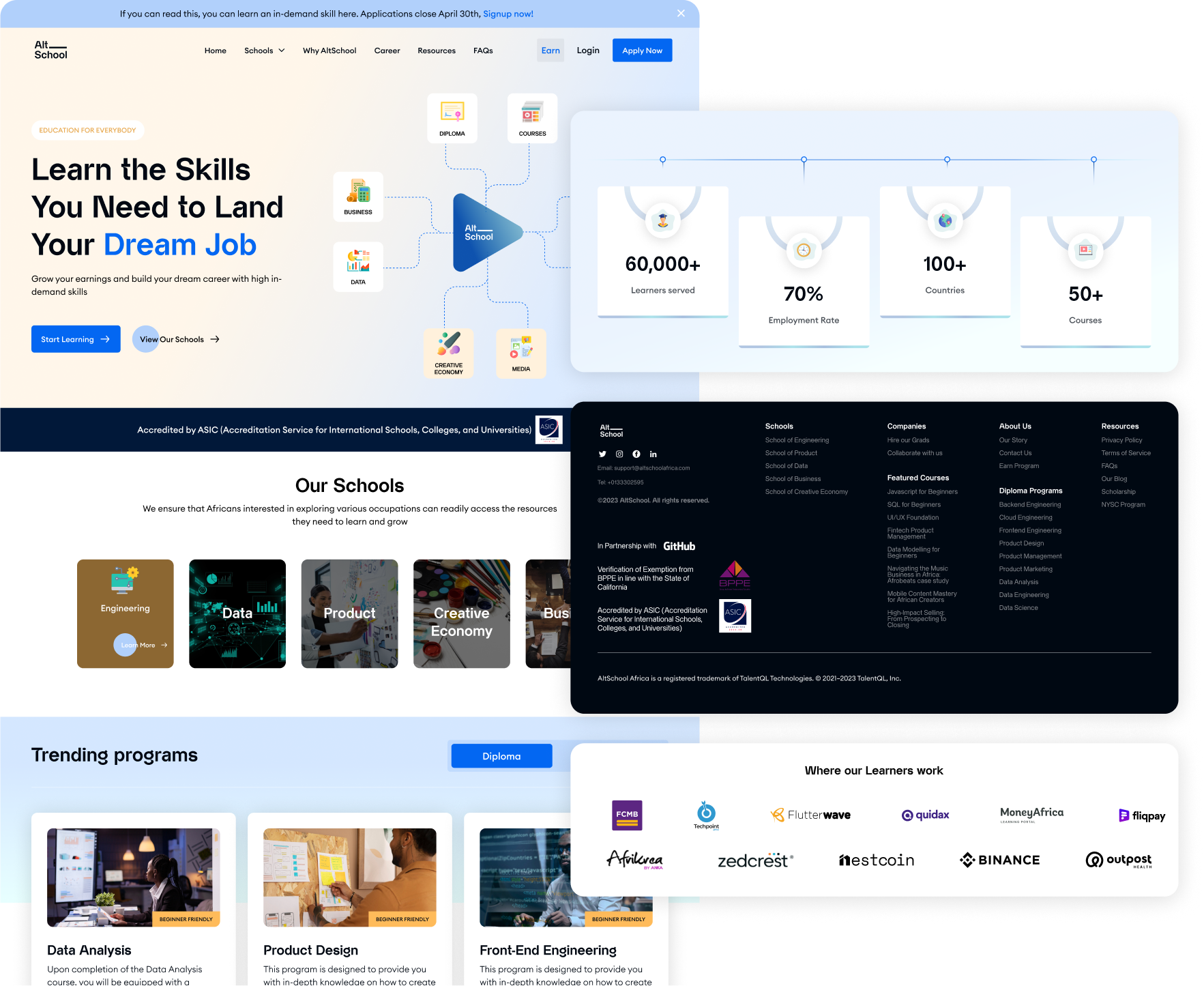
Website
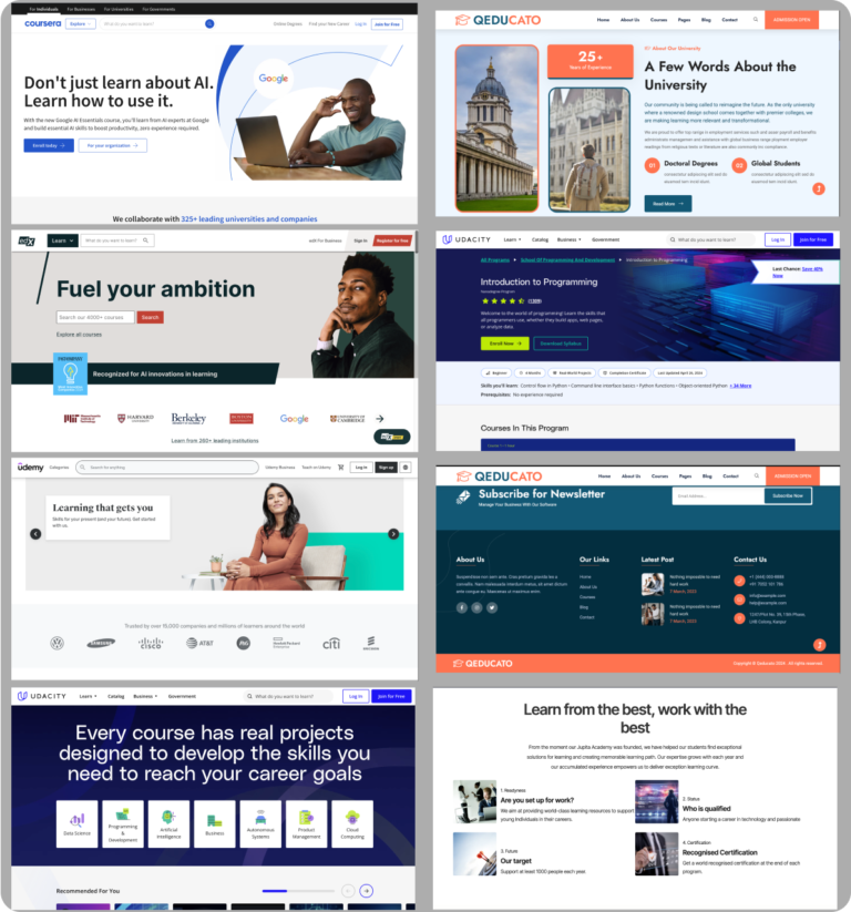
I led the redesign of the entire website to feature the company’s new brand identity and latest product offerings. To start with, I curated references from various websites sharing similar concepts to AltSchool’s vision.
The website redesign is exceptionally comprehensive and has yielded impressive results. We observed a remarkable increase in applications, with a surge of approximately 30%. Additionally, there has been a significant reduction of 40% in support queries. This success can be attributed to the meticulous planning of the Information Architecture, which enables users to effortlessly find what they are looking for.
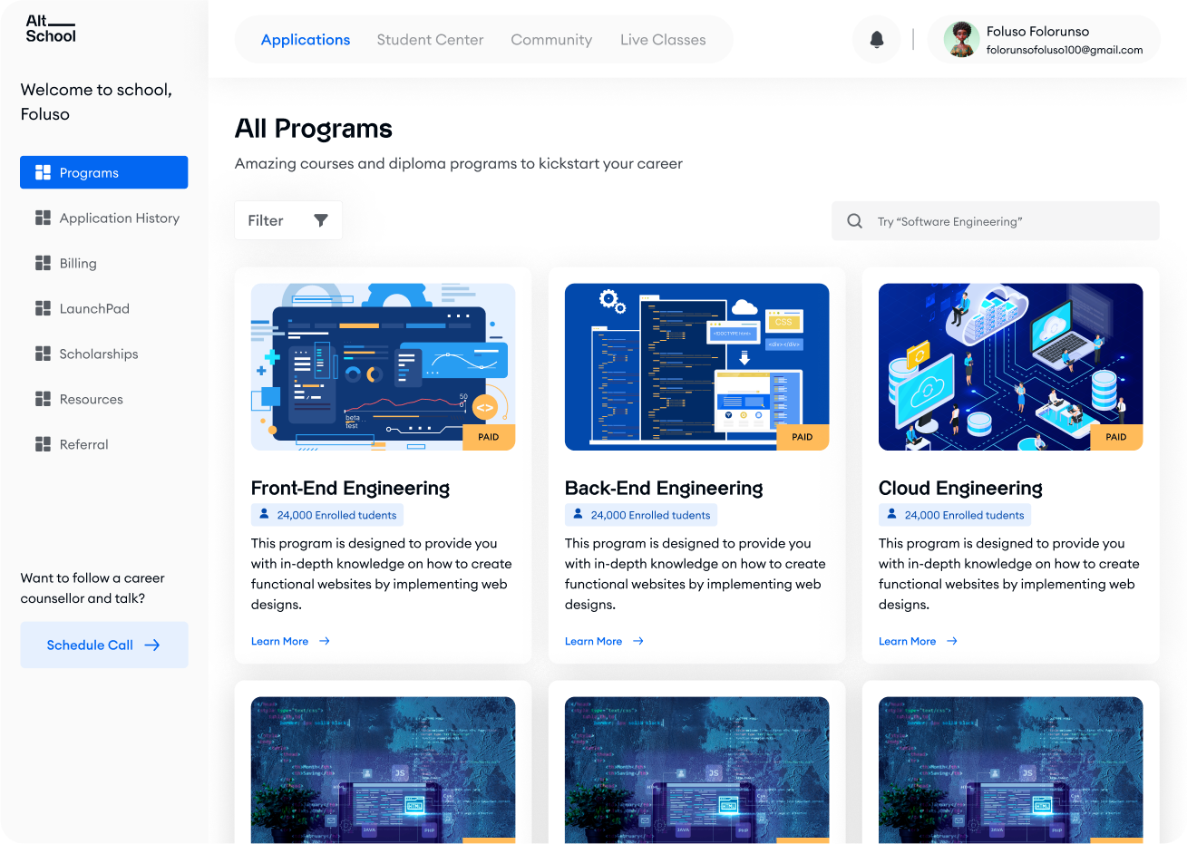
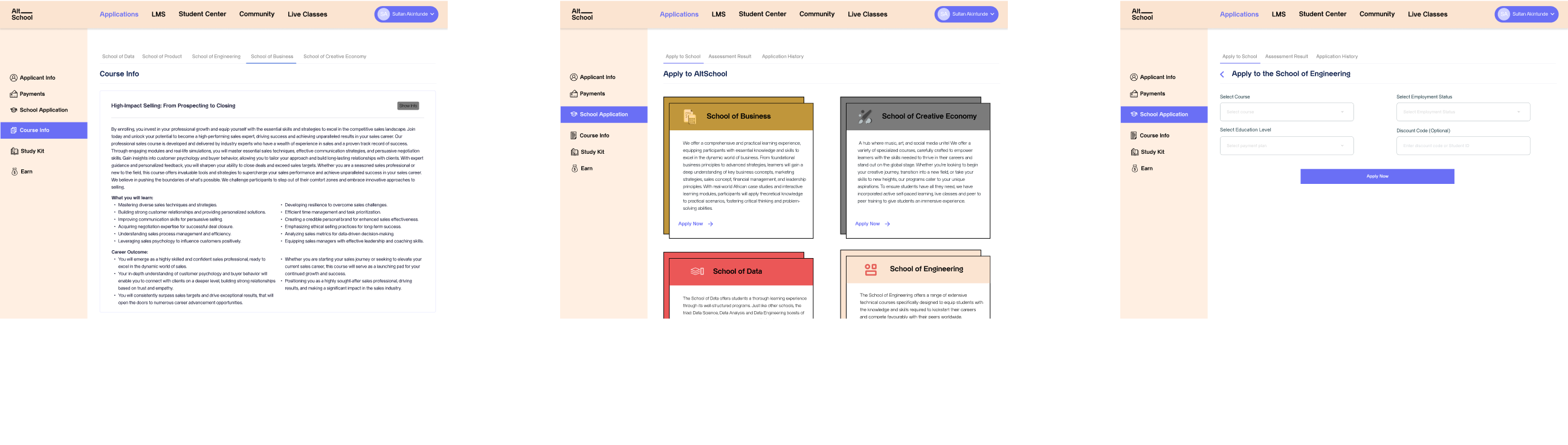
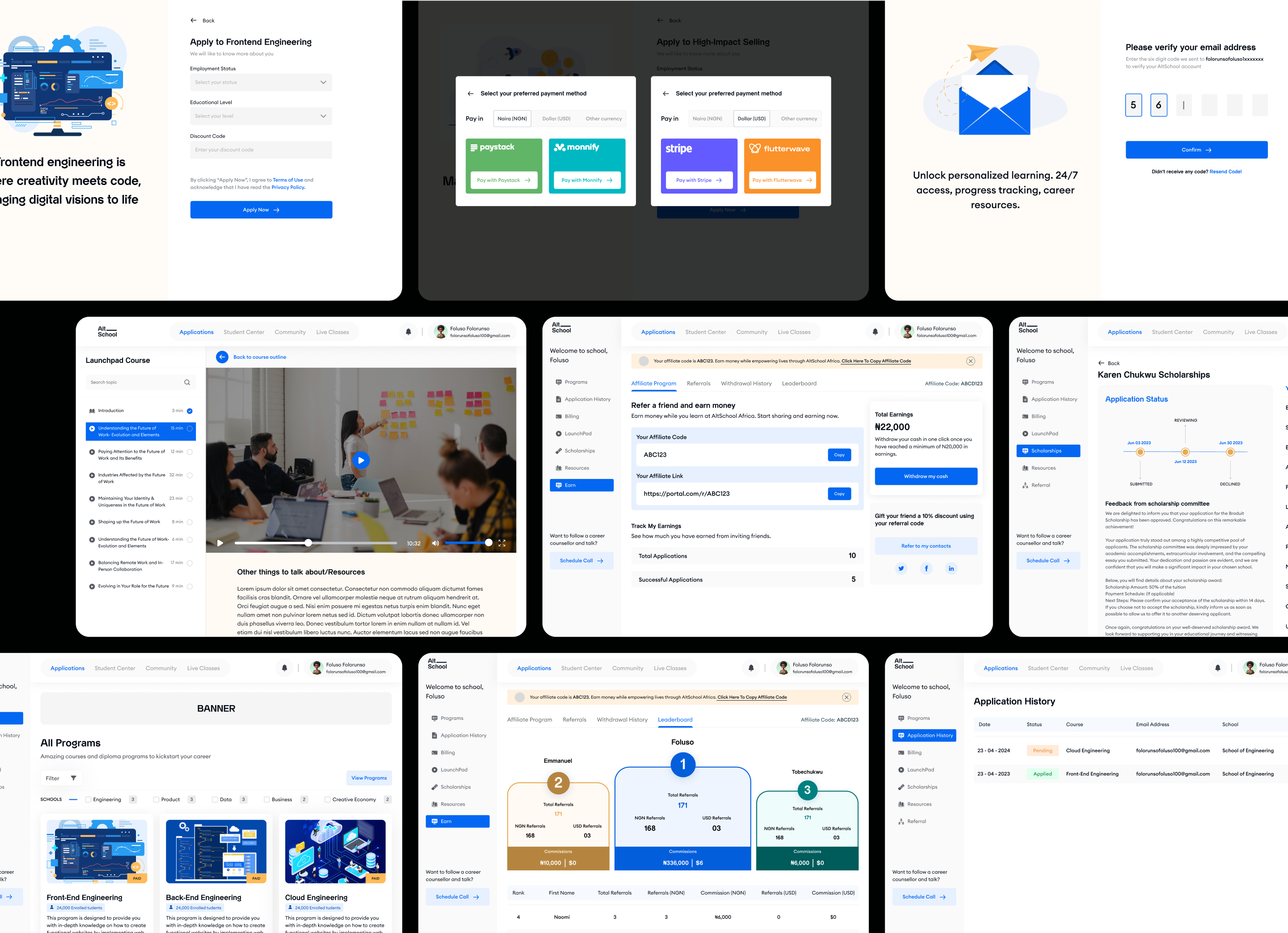
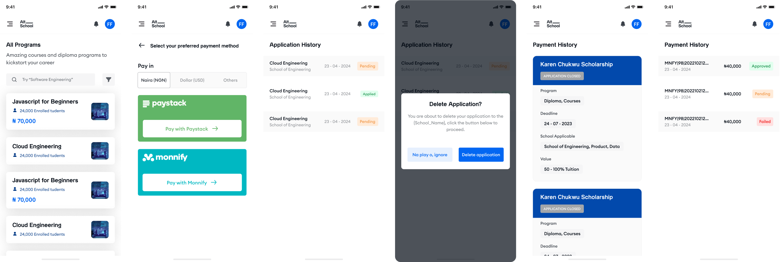
Student Portal
The student portal exhibited significant clumsiness, with its navigation and layout appearing disorganized. Upon analysis, I identified numerous unnecessary user flow complexities. For instance, to apply to a program within the portal, users were required to navigate to view program details, then navigate elsewhere to select the school offering the program, and finally make a selection from all programs available within that school. This convoluted flow proved stressful and disrupted the user experience.
To tackle this issue in the redesign, I broke each school into its respective programs, on this page, users can use both the search and filter features to narrow down their options. When users choose to learn more about a particular course, they are directed to a detailed page where they can access comprehensive information about the course and have the option to apply or purchase, depending on the program type. Additionally, users can easily navigate back to the main page containing all available programs.
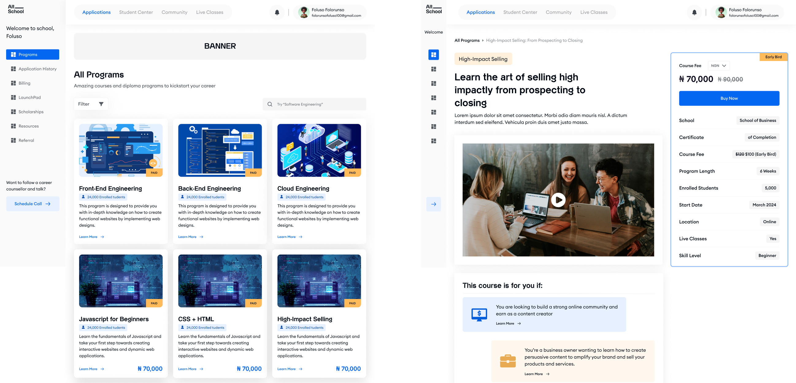
OTHER PORTAL SCREENS
Small tweaks, significant impact
Considering the project’s timeline and current status (with tasks prioritized accordingly), I made slight adjustments to the existing designs to temporarily improve the user experience on the portal.
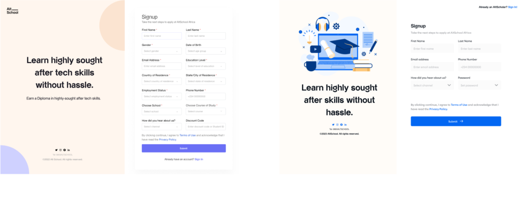
For instance, I addressed the sign-up screen, which previously required users to fill in numerous fields. Recognizing that users registering for an account might not immediately need to complete an application, I relocated application-related fields to a separate section for program enrollment. This move move significantly decreased the rate of form abandonment by users by almost 45% and enhancing overall user engagement.
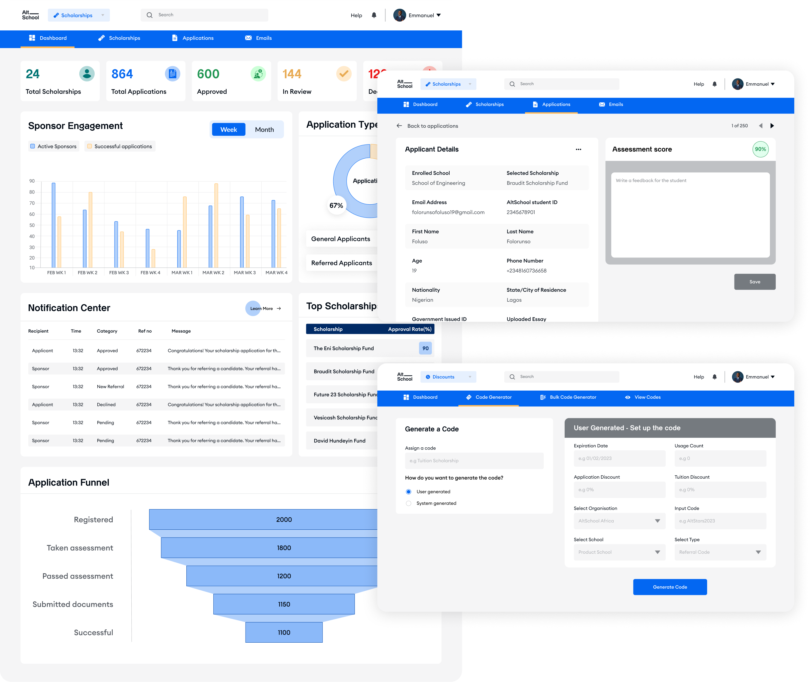
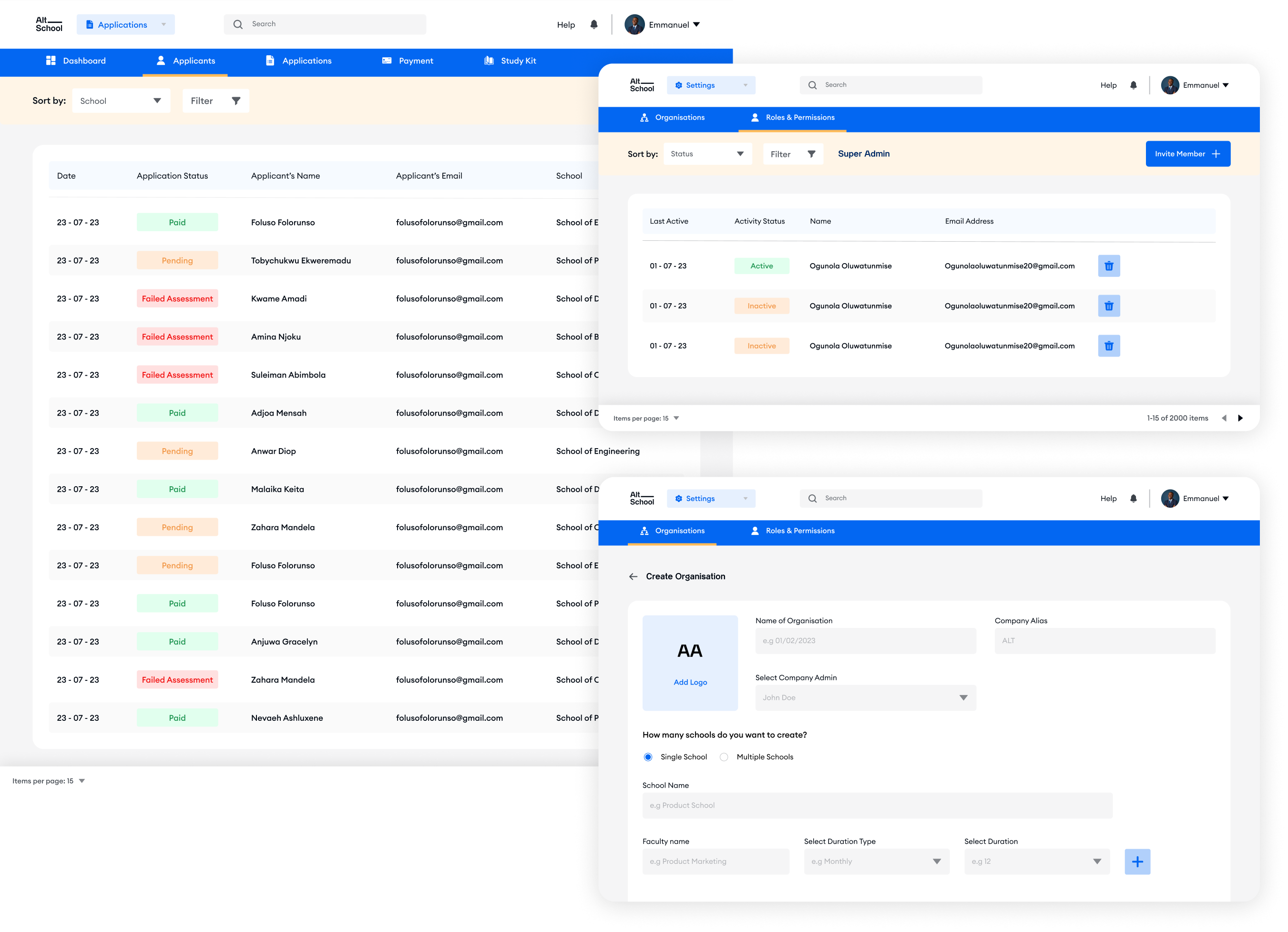
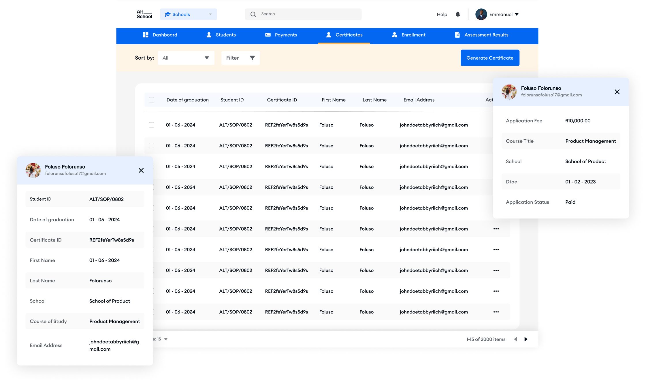
Admin Portal
I revamped the admin portal to make it more user-friendly and added extra features to boost its functionality.
RESPONSIVE DESIGNS
IMPACTS
Increase in Applications
The redesign led to a significant surge in applications. Our enhanced user experience attracted a larger pool of applicants, resulting in a 30% increase in applications compared to the previous quarter.
Decrease in Support Queries
By providing clearer information and intuitive navigation on our website, users were able to find answers to their queries independently, leading to a 40% reduction in support tickets over the past month.
IN RETROSPECTS
My Takeaways
Reflecting on the initial designs of our product, it’s evident that there were significant lapses that needed to be addressed. However, despite these issues, the product managed to achieve success and scalability. This observation highlights the importance of recognizing that while design is a critical component of a product’s success, it’s not the sole determining factor.
I think it’s crucial for designers to adopt an open-minded perspective that acknowledges the interplay of various departments and disciplines within the organization. Collaboration among teams—from product development to marketing to customer support—are essential for creating holistic and impactful solutions.
Ultimately, our success in the redesign project relects the power of collaboration and the importance of taking a holistic approach to product development.
MORE PROJECTS
Need further assurance that I’m the right fit for your organization? Then take a look at any of these 👇