The admin dashboard was built to provide comprehensive monitoring, communication, and control of the movement of fuel across the nation and the distribution of fuel from one vessel to different locations. It provides detailed insights into vital parameters such as fuel consumption, fuel prices, fuel levels, and fuel distribution.
My Role
Product Designer
Interaction Designer
Project Duration
4 days (2022)
Type
Web App
Admin Dashboard
Industry
Oil & Gas
Client
NNPC
Goals
To effectively monitor and communicate the movement of fuel across the nation and the distribution of fuel from one vessel to different locations, as well as other vital parameters. The fuel tracking system provides real-time data and insights, identify inefficiencies, and maximize the operational efficiency.
Constraints
I was under immense pressure to deliver a functional prototype to the stakeholders within four days of receiving the project. Every hour counted, and I was determined to meet this tight deadline. Despite the time crunch, I was able to successfully meet the deadline and deliver a high-quality product.
My Role
As the sole product designer on the project, I designed and prototyped a major dashboard to present to the stakeholders. My work was supported by the engineers that implemented the dashboard, ensuring its success. With my design skills and the engineers’ technical proficiency, the dashboard was a resounding success.
GETTING STARTED
Overview
NNPC Limited is a world-class energy company with a diverse range of businesses and operations across the entire spectrum of the energy value chain. Through its strategic partnerships with leading foreign oil companies, NNPC is committed to unlocking the potential of Nigeria’s abundant fossil fuel resources and driving the country’s economic growth.
Prepping the board
After reviewing the client’s brief and discussing the skills needed for the project, I determined that the main focus should be on UI design and prototyping. The popular brand’s logo and brand colours were easily accessible, so no extra research was necessary in this area. However, I did take time to look at the dashboards the client wanted as a reference, to gain a better understanding of their expectations.
After diving into Figma, I quickly created a style guide and designed a few components to get the project off the ground. This ensured the project had a solid foundation that could be built on throughout its development.
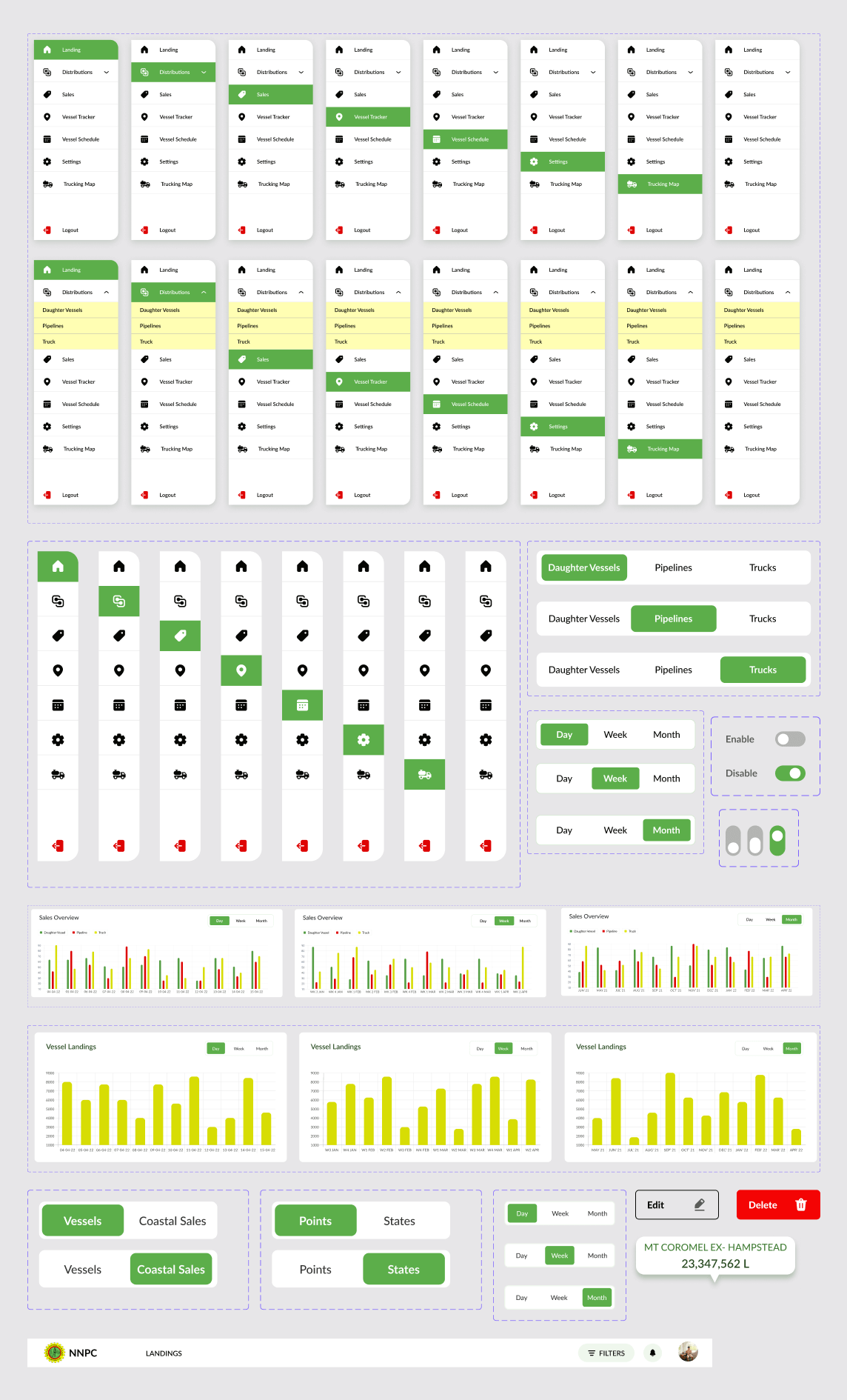
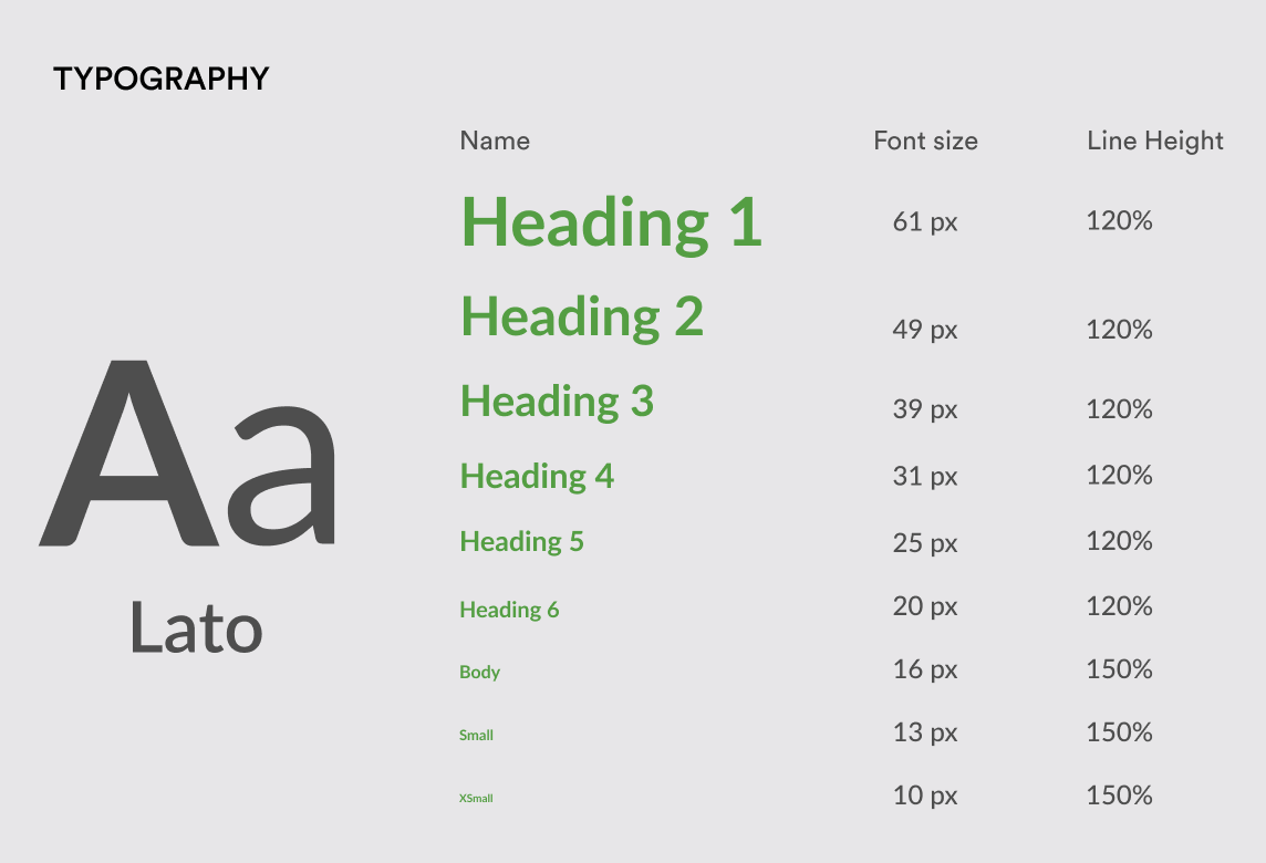
COMPONENTS
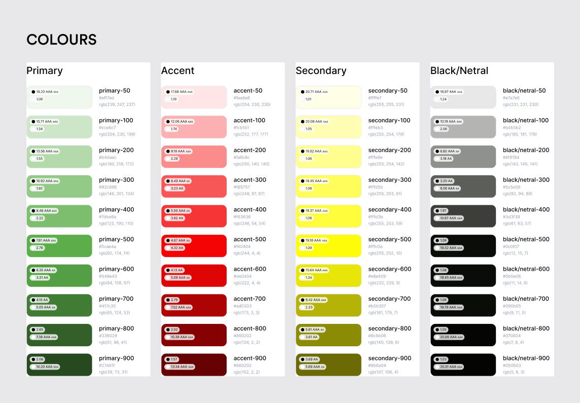
Style Guide
Results
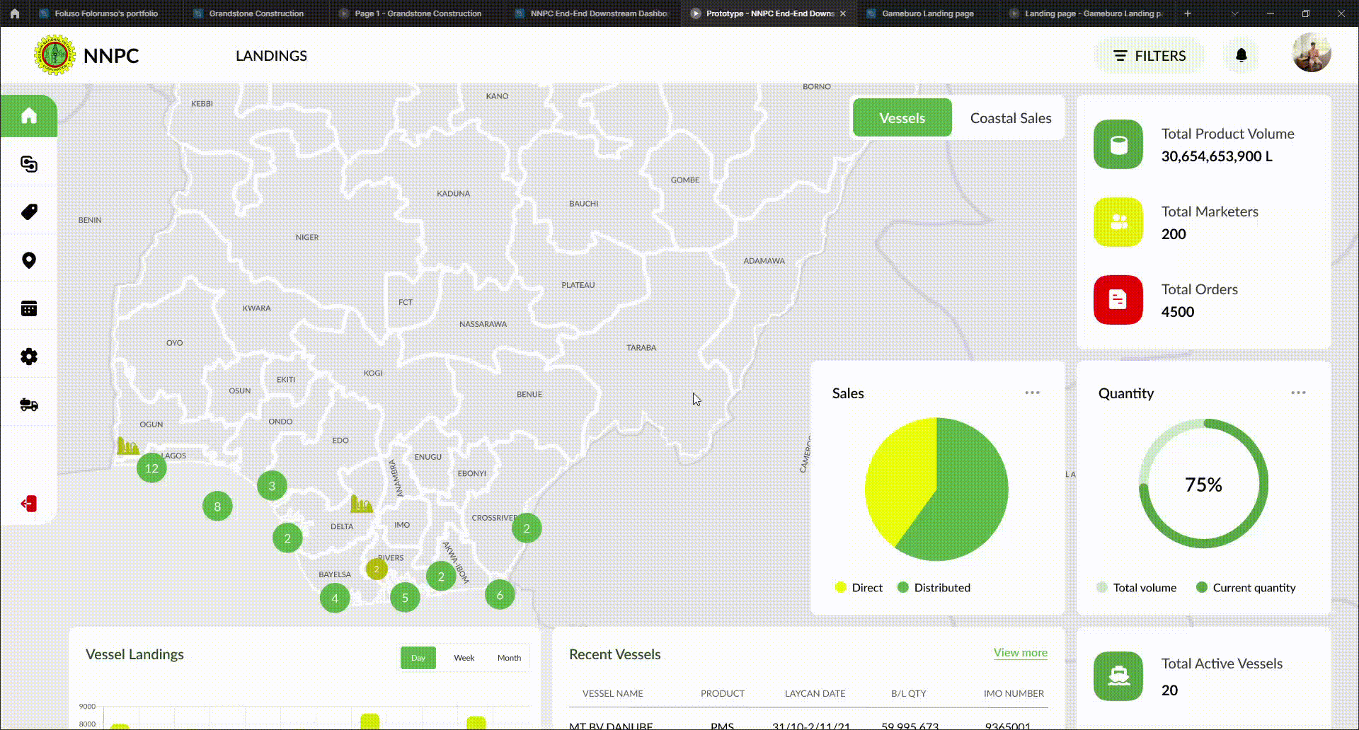
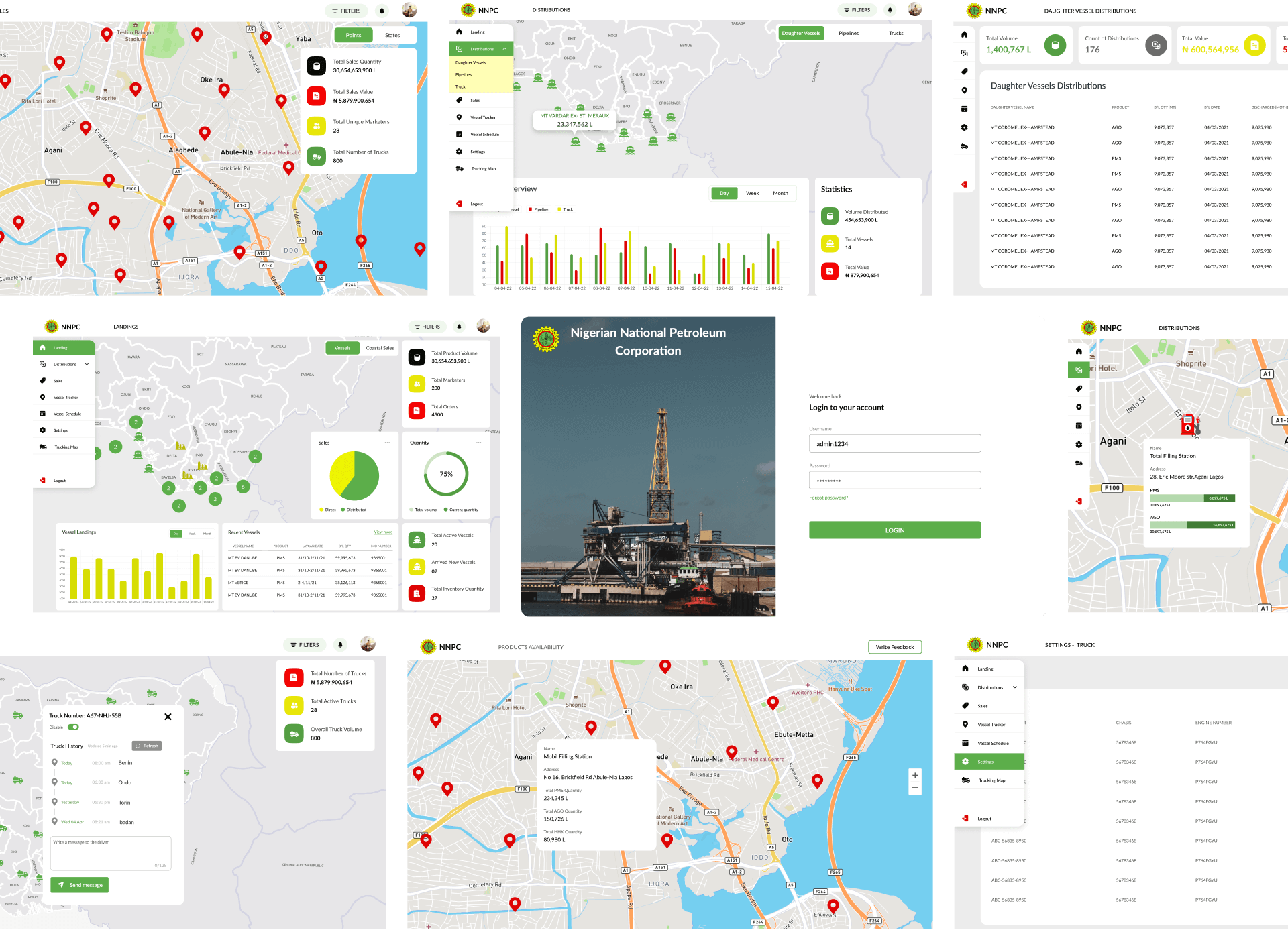
FUNCTIONAL PROTOYPE
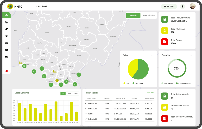
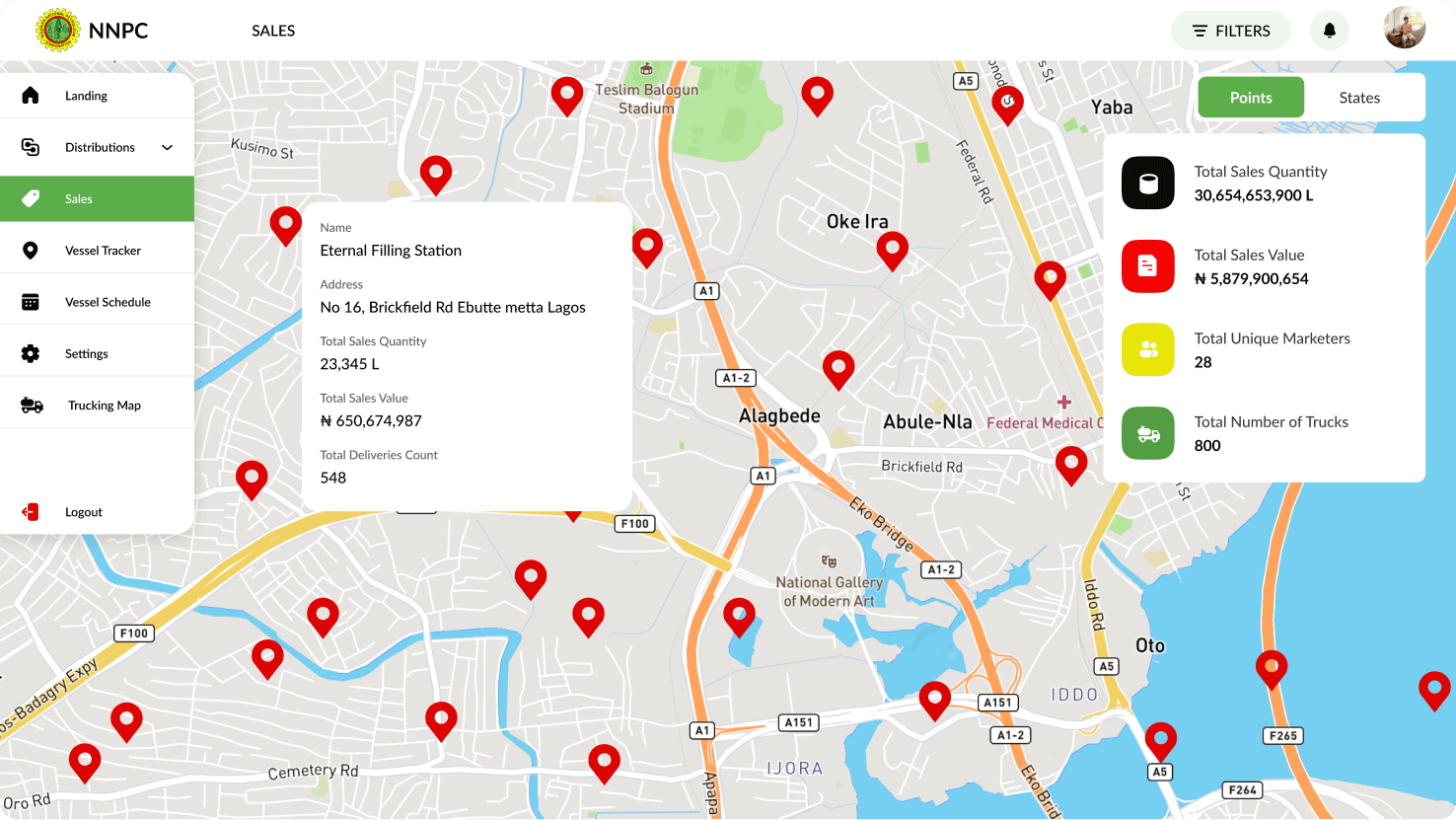
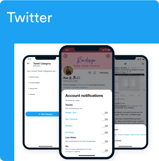
FEW OF THE UI SCREENS
REFLECTIONS AND LEARNINGS
If one can accurately grasp the concept of the project through both the brief and conversation, then half of the work is already done; subsequently, it is just a matter of creatively fleshing out the ideas that could have surfaced during the debriefing. By understanding the project thoroughly and bringing your creativity to the table, you can achieve great results.
In order to ensure that my users feel comfortable with the design, careful consideration was given to the choice of fonts, icons and colour combinations. Taking into account the needs of my users, I have designed the product with their user experience in mind, so that they can interact with it easily and without feeling overwhelmed.
MORE PROJECTS
Need further assurance that I’m the right fit for your organization? Then take a look at any of these 👇